


There are Report Cards, and Then, ... There are Report Cards
Remember way back when we got those report cards during, and at the end of the school year; and your parents had to sign off on them? That has changed a bit today. Now, however, Planet Earth gets a Report Card too. This one is from scientists who gather data, measure, quantitate, assess and interpret a variety of different aspects and conditions of Earth’s climate health. The report card suggests there are problems but they are not of Earth’s doing; they are because of us.
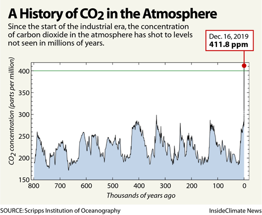
The first mark or grade is for the level of carbon dioxide in the atmosphere. See graph from InsideClimate News labeled, “A History of CO2 in the Atmosphere.” The graph is current through December 16, 2019. Unfortunately the number of 411.8 ppm is about 2 units more than last year’s which in this case is not good. This graph is telling in that the amount of this greenhouse gas [GHG] in Earth’s atmosphere today is the highest, by far, in the last 800,000 years. Not good; the number should be decreasing. This is a failing grade.
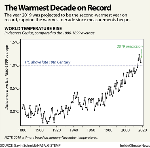
What is the impact of these high levels of carbon dioxide? The record of direct atmospheric temperature measurements is about 140 years and so this lets us compare the planets temperature during that time interval.
See the graph, also from InsideClimate News, labeled “The Warmest Decade on Record.” As it turns out 2019 is the second warmest year in the climate record and this past decade is the warmest decade since measurements began. Not good either. This is a failing grade as well.
So now, as a direct result of the highest levels of carbon dioxide in the atmosphere, and the warmest decade in the temperature record, we have a graph that shows the oceans are collecting most of all of this heat. See graph labeled: “The Oceans Are Heating Up” also published by InsideClimate News. The startling thing here is that a large amount of the excess heat trapped by carbon dioxide in the atmosphere is finding its’ way deep into the oceans; as deep as 6,600 feet! If all of this had not gone into the oceans, we would all have been cooked.
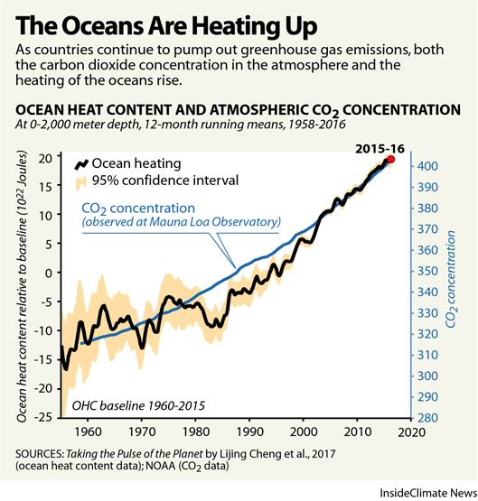
In that same graph with the jagged “Ocean Heating” line there is a smooth line labeled CO2 concentration. The two lines follow one another closely. As the CO2 concentration increases the heat absorbed into the oceans follows suit.
With all of the talk recently about “Global Warming,” “Climate Emergency,” “Climate Change,” and “Fridays For Future” Marches and demonstrations [led by Greta Thunberg] where and why is the level of carbon dioxide still increasing?
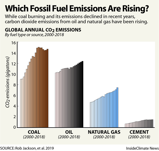
See the bar chart from InsideClimate News labeled, “Which Fossil Fuel Emissions Are Rising?” The first three sets of data refer to Coal, Oil, and Natural Gas. Fortunately, for human health reasons alone, the combustion of coal for power generation has begun to decrease. However, the consumption of oil and natural gas has continued to increase significantly and show no signs of slowing down.
The fourth set of data in this bar chart is labeled Cement. The production of cement, one of the most energy intensive and widely used construction materials globally, continues to increase. The raw material, calcium carbonate rock has to be mined, transported, crushed to a powder and then heated to extremely high temperatures [> 2,000 degrees F]. This whole process releases very large quantities of this GHG.
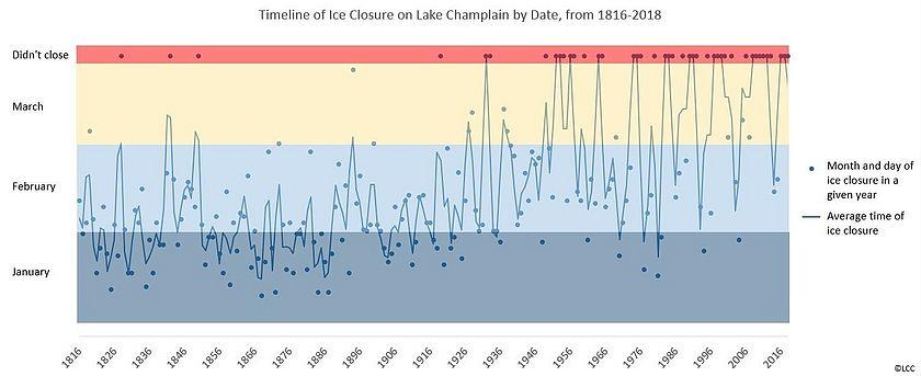
The interesting thing is that we do experience right here in the North Country, the impact of these increasing levels of GHGs.
Note the graph titled, “Timeline of Ice Closure on Lake Champlain by Date, from 1816 – 2018,” from a recent newsletter of the Lake Champlain Committee. There is a lot of information contained here so let’s look at it in some detail. Across the dark bar at the top are small black dots for those years that the lake “Didn’t close.”Note the increased frequency of those dots towards the right in recent years.
Next, look at the three shaded areas that represent the three months of January, February, and March. In the 1800’s the lake froze over most often during January and February as can be seen by the dots and “average time of ice closure.” As we move to the right and the most recent years, the dots and line moves up and we see that the lake freezes over, if at all, mostly in February and March. This is a major change for a lake of this size and depth.
A ten word summary of climate change can be stated as follows:
It’s Real.
It’s Us.
It’s Bad.
Experts Agree.
There’s Hope.
An example of Hope lies in the Hornsea Wind Turbine Project in the North Sea off the coast of England. Stage 1 is complete with 171 turbines; Stage 2 is underway, with Stage 3 scheduled for completion by 2024-5. When finished, this project will generate enough electricity to power about 4.3 million homes.
And so it goes ...
The scientific career of Raymond N. Johnson, Ph.D., spanned 30 years in research and development as an organic/analytical chemist. He is currently founder and director of the Institute of Climate Studies USA (www.ICSUSA.org). Climate Science is published monthly.